If you have read anything at all about room styling, you have probably come across the 60-30-10 rule: sixty per cent dominant, thirty per cent secondary, ten per cent accent. It's not a bad rule. It's the reason a lot of rooms end up just about right. But there is also a slight problem with this rule, because what it does is count colours without specifying what each one is for. And limiting your palette to only three colours is also one or two colours short of what a room actually needs to feel balanced.
Below I'll walk you through how we build a colour palette to work within.

The five roles
Every scheme we create is put together using five main colours, and every colour gets a job and a proportion assigned to it. Together these colours become a styling recipe for how much of each tone you should let into a room.
The grounding colour, about 40 per cent, covers the walls, ceilings, and often also floors and other large, quiet surfaces. This is the tone the room sits on, and it should be the one you notice the least. It is often neutral and will allow layers of other colours and textures to be placed on top without clashing.
The primary colour, about 24 per cent, is the main soft mass: sofas, dining chairs, maybe the bed, sometimes curtains. This is the colour that does much of the work of making a room feel warm or cool.
The secondary colour, about 18 per cent, brings timber, weave, and natural warmth: wood, jute, linen, wool, and rattan. It's the layer that stops a neutral scheme from going cold, and it's almost always a material rather than a paint.
We also need depth, about 10 per cent, and this consists of one dark note: a slate hearth, a black vase, a dark lamp, a charcoal-coloured side chair. The eye needs somewhere to settle, and without it a pale room feels unsettled rather than calm. This is the role a lot of people forget about, but it is important because it anchors the room.
And last but certainly not least, the accent colour(s): four to eight per cent. I say colour(s) because this job is usually primarily one tone but can occasionally be split between two mutually complementary or pleasantly contrasting hues. This can be a cushion or two, a bowl, a vase with eye-catching flowers, a chair in an unexpected colour, an attention-grabbing piece of art. This is the role most people overdo, and it's the fastest way to mess up and muddle everything the other four are doing.
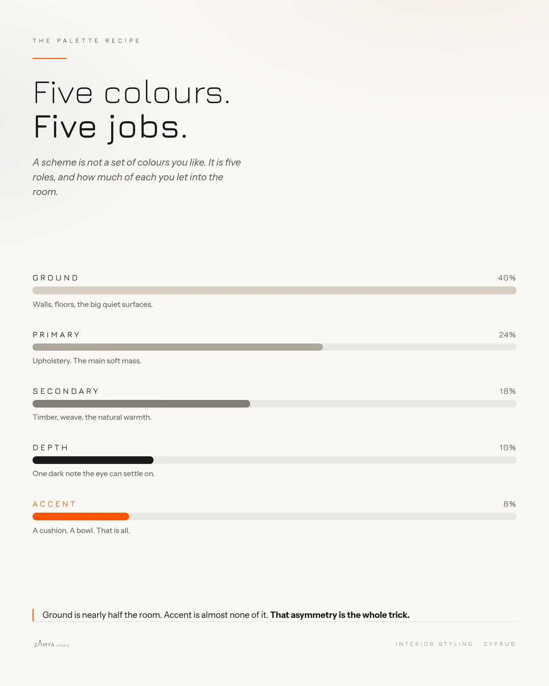
Look at the image above and notice the shape of the five hues and the numbers. Ground is nearly half the room. Accent is almost none of it. That asymmetry is the whole trick, because it creates that subtle and calming balance a scheme built on equal amounts of everything can never achieve.
Why the accent has to stay small
Restraint is what reads as expensive. One of our looks puts aged brass at four per cent, and the brief for it is metal in small glimpses only: a thin edge catching the evening light. The moment there are four of them scattered across the room, it stops working as an accent and starts feeling like a showroom.
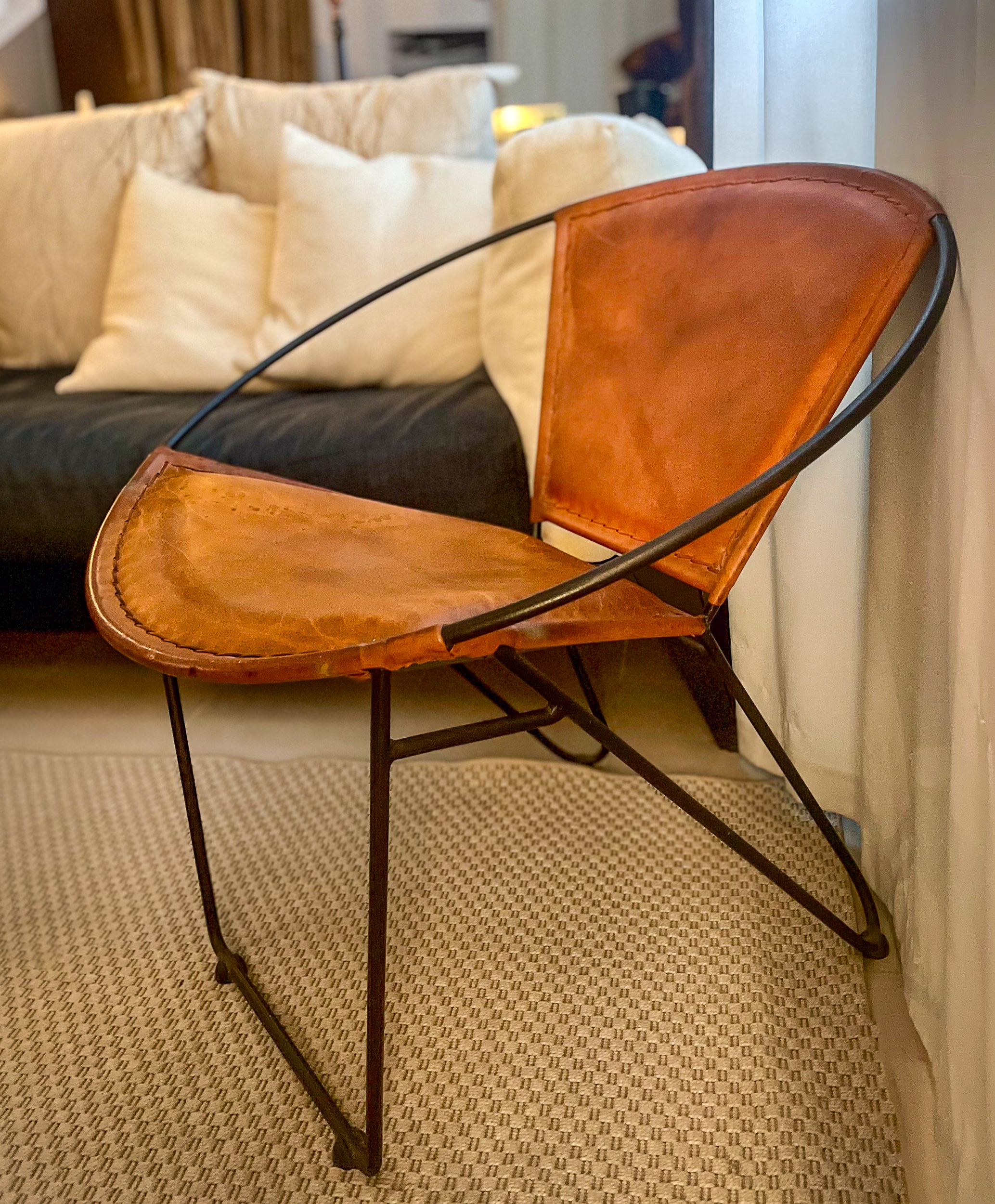
The same is true of colour. One well-placed cognac leather chair in a room of muted neutrals will centre a person's focus and calm the mind. Four cognac things spread about the room scatter the focus, and the result is unsettling.
Proof: two rooms with no colour in common
Here are two of our Signature Looks. Pissouri Shore is a warm coastal neutral: all chalk, grey, beige, and the occasional charcoal and ochre. Mediterranean Modern is built on honed travertine with a prominent deep cypress green that shares the middle space with a contrasting neutral colour. These two are then set against a light grey and complemented by a hint of brass for warmth and black for depth.
These two schemes share no colour at all. Put them side by side as bands of proportion, and they're the same rough shape.
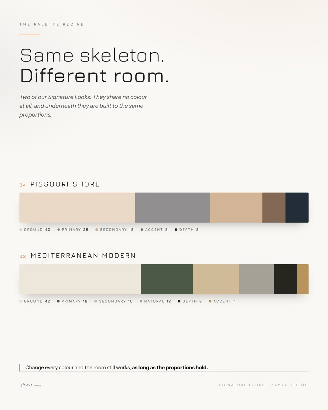
Pissouri Shore runs 40 per cent ground, 26 primary, 18 secondary, then 8 and 8 for accent and depth. Mediterranean Modern runs 42 ground, 18 primary, 16 secondary, with a twelve per cent natural tone sitting in the middle, then 8 depth and just 4 for the brass. Different rooms, different locations, different clients: the skeleton underneath is the same.
And that's the beauty of using this model: you can change every colour in a scheme, and the room still works, as long as the rough proportions hold. Change the proportions dramatically, and the room becomes much harder to balance.
Where a palette actually comes from
We draw a lot of our inspiration from the natural elements that surround us. The Pissouri Shore palette came from one photograph of a small piece of shoreline below Pissouri, Cyprus, shot late in the afternoon when the fading daylight enveloped everything in a warm embrace.
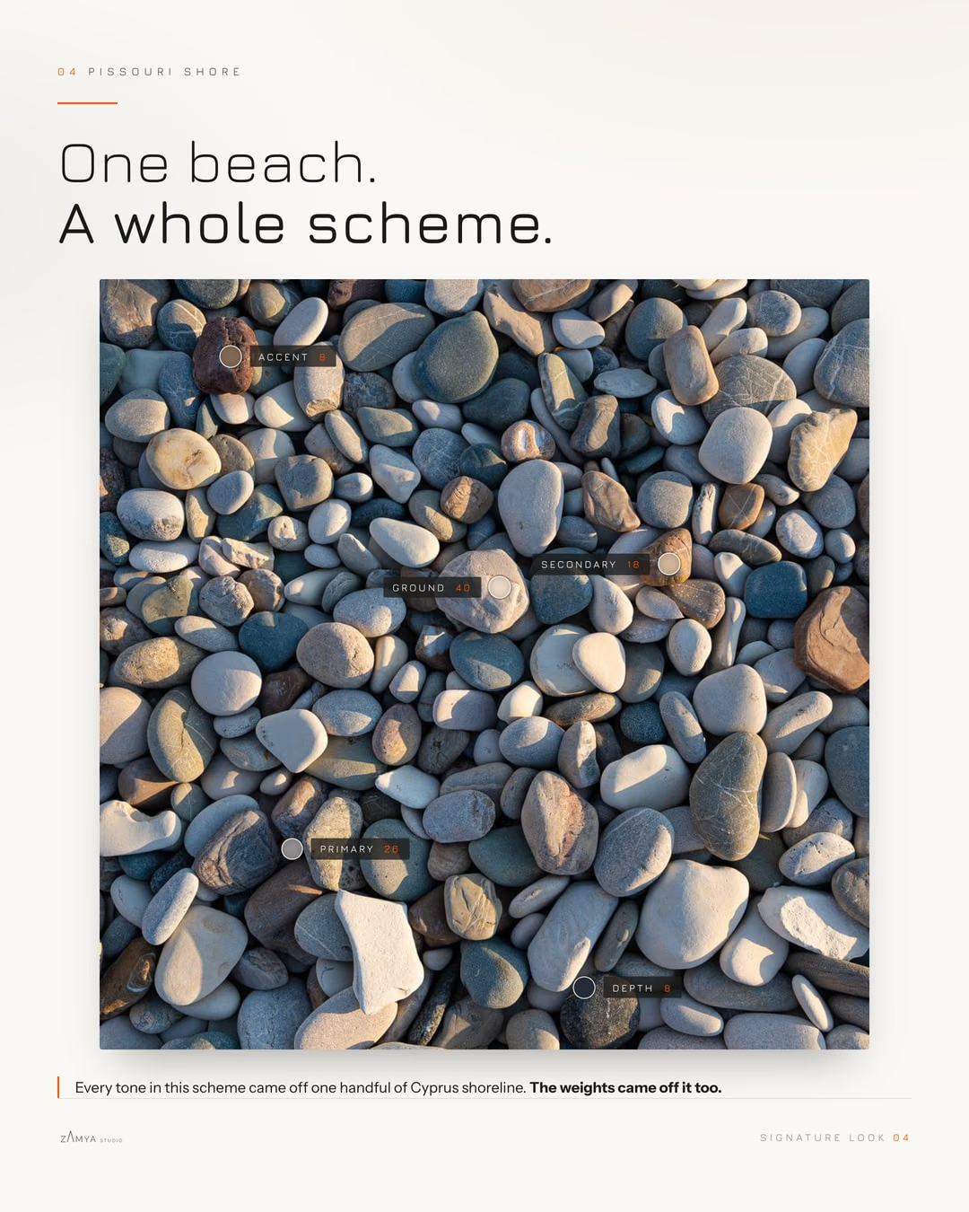
Everything is already there. Sun-bleached chalk, warm beige and grey hues do the quiet work, a few sea-tumbled stones bring ochre and rust through the middle, and one or two graphite pebbles anchor the lot.
That's the best test we know for a palette. If you can't find it somewhere in the local landscape, then a room will always feel somewhat out of place.
Start with the ground
If you take one thing from this, let it be this: decide your ground first and commit to it properly. Most schemes go wrong because the ground is chosen last, or split between three near-misses that fight each other across a room.
Pick the tone the room sits on. Give it forty per cent and the confidence to be boring. Then layer the other four on top in the rough percentages outlined above, and do use the accents sparingly.